Harnessing Twitter Sentiment Analysis for US Airlines: A Streamlit Dashboard Exploration
A Technical Exploration of Streamlit, Pandas, and Plotly for Real-Time Sentiment Analysis on Social Media
Introduction:
In today's digital age, social media platforms like Twitter are goldmines of consumer sentiment. This blog explores our latest project: a Streamlit dashboard designed to analyze and visualize sentiments from tweets about US airlines. By leveraging data science techniques, we provide insights into public opinion, helping businesses and enthusiasts understand the prevailing sentiments around airline services.
Purpose of the Dashboard:
The primary goal of this dashboard is to offer a user-friendly interface for dynamically exploring tweet sentiments toward US airlines. This tool is intended for marketers, analysts, and airline executives to gauge customer satisfaction and identify areas needing attention in real time.
Technical Setup:
Streamlit: Powers our interactive web app, enabling rapid frontend deployment of our Python scripts.
Pandas: Manages and manipulates the data—crucial for handling our dataset of tweets.
Plotly Express: Provides engaging, interactive charts for better data visualization.
WordCloud and Matplotlib: Used to create visual representations of text data, highlighting frequent terms in tweets based on sentiment.
Key Features and Walkthrough:
Dashboard Introduction:
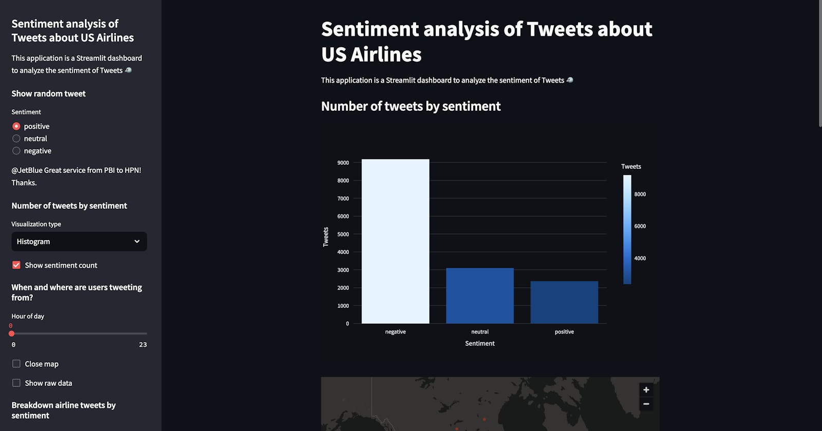
- The main page and the sidebar introduce the application, emphasizing its focus on the sentiment analysis of tweets related to US airlines.
Data Loading with Caching:
- The application efficiently loads tweet data from a CSV file using Pandas, with caching to speed up reload times. This ensures that user interactions remain fluid.
Interactive Tweet Display:
- Users can select a sentiment (positive, neutral, negative) to display a random tweet reflecting that mood. This feature offers a real-time snapshot of public opinion.
Sentiment Distribution Visualization:
- The sidebar allows users to choose between a histogram or a pie chart to visualize the overall sentiment distribution. This aids in quickly understanding the volume and proportion of sentiments.
Geographic Mapping:
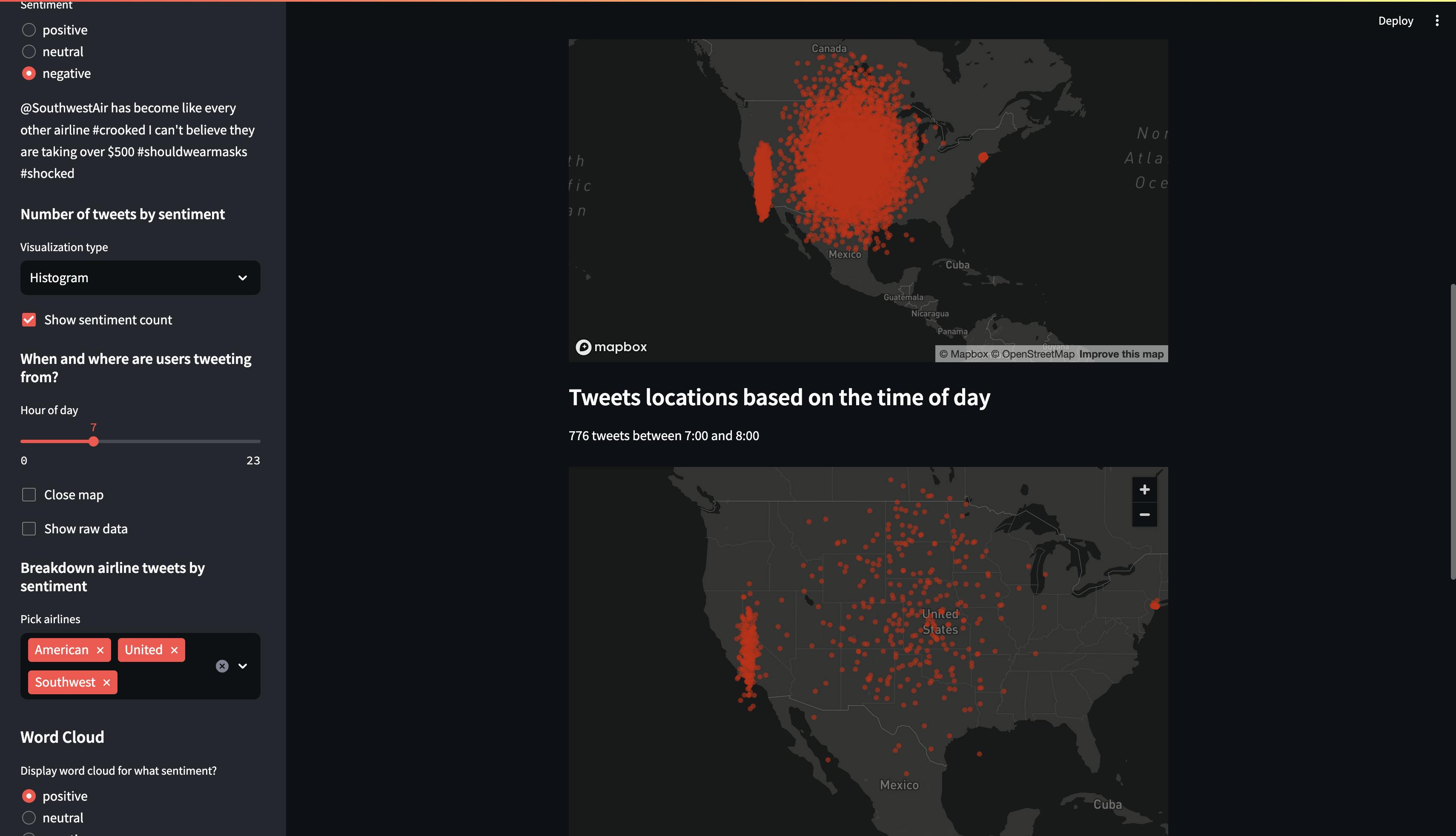
- The dashboard maps tweet locations, providing a geographical perspective on the data. A slider lets users filter tweets by the hour, revealing temporal patterns in tweeting behaviour.
Detailed Sentiment Analysis by Airline:
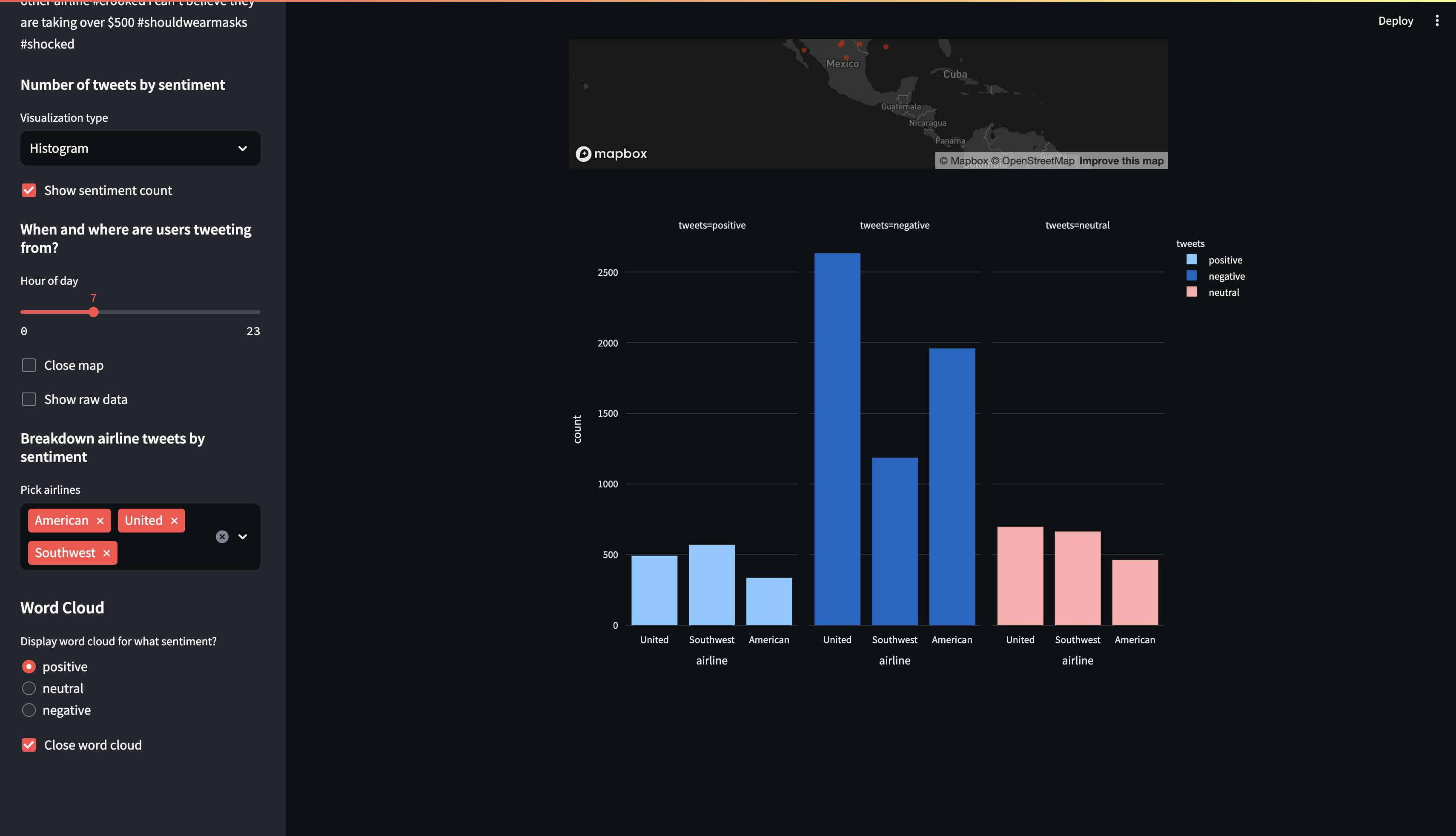
- Users can compare sentiment across different airlines, providing valuable insights into which airlines receive more positive or negative feedback.
Word Cloud for Sentiment Analysis:
- The application generates a word cloud for chosen sentiments, visually emphasizing the most common words in tweets, which helps in identifying trending topics or issues.
Insights and Analysis:
By interacting with various components of the dashboard, users can uncover patterns in sentiment that might correlate with specific events, promotions, or service changes by airlines. For example, a sudden spike in negative tweets might coincide with a publicized customer service issue.
My whole code is accessible on GitHub click here
How to Use the Dashboard:
This dashboard is designed for ease of use:
Explore Different Sentiments: Click through the sidebar options to view data filtered by positive, neutral, or negative sentiments.

Visualize Data: Switch between histogram and pie chart views to see the data representation that best suits your analysis needs.

Investigate Temporal Trends: Use the hour slider to see how tweet volumes and locations change throughout the day.

Drill Down into Data: Use multi-select options to filter tweets by specific airlines and analyze their performance.
Conclusion:
The Streamlit dashboard dedicated to analyzing tweets about US airlines is an essential tool for real-time understanding of customer sentiment. By converting raw data into dynamic visualizations and accessible formats, this dashboard empowers stakeholders to swiftly pinpoint sentiment trends and make informed decisions. Whether you're examining overall sentiment, specific airline performances, or geographic trends, the insights provided are invaluable for businesses looking to enhance their customer service and operational strategies.
Thank you for exploring the potential of sentiment analysis through our Streamlit project. As I continue to improve and expand this tool, we look forward to uncovering more valuable insights at the intersection of data science and social media.
